


Hot n cold: what colours make a lasting impression on readers
February 26, 2020
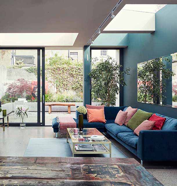
Colour is one of the most powerful visual elements we have. In art or in business, you can use colour to influence people, create moods, communicate ideas and make an impression on the reader or viewer.

Warm Colours
Pink
Largely labeled a “girly colour”, we use pink usually to communicate sensitivity, romance, innocence and a female touch. It’s a great accent colour that adds a pop of fun.
Red
The colour red immediately draws attention as it’s one of the most vibrant colours on the spectrum. We associate red with danger (think blood and stop signs) but also vitality, romance and half of the Christmas colour scheme.
Orange
Closely related to the fruit of the same name and colour, orange represents health, nutrition, energy and life. We associate it with fire and the sun. You can use orange to grab attention in a more fun and less striking way than with red.
Yellow
Yellow is widely related to cheerfulness and hopefulness. Also associated with the sun, we connect yellow with warm, freshness and youth over everything else.
Green
Most commonly green is used to evoke thoughts of nature, feelings that are fresh, clean, organic and full of life. It’s a cheerful and bright colour, or you can use a darker shade to communicate maturity and stability.
Cool Colours
Blue
If you’re looking for depth, serenity and calm, think blue. We think of the sky and the ocean, two of the largest natural elements we see regularly. Blue also communicates cleanliness and purity, used on a lot of cleaning products in the form of fresh, clean water.
Purple
Depending on the shade, purple can also be a warm colour, but more often it’s cool. Deeper purples are typically associated with maturity, sophistication, royalty or regality. Lighter purples are more closely connected to youth, creativity, fun and femininity.
Black
It’s hard sometimes to use black properly because it’s so powerful it can overpower your design. But used right, it can communicate elegance and power. A design that is meant to be sleek and sophisticated can benefit from sharp and clean black shapes or lettering.
Brown, Gray, White
These colours tend to work best as accents or backgrounds, especially tinted shades of grey. It’s becoming more and more popular to use grey as a colour for text as opposed to black. These colours can help to make the above colours pop. For design, white is falling out of popularity as a background and light shaded colours are taking its place. But it can still be a powerful element for communicating purity, minimalism, cleanliness and simplicity. Browns can sometimes communicate the opposite - dirt and decay - but can also communicate earthiness and humility.
Articles
Or just taming the clutter at your front door...
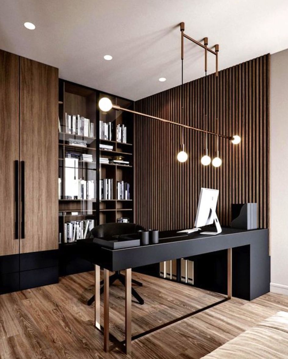
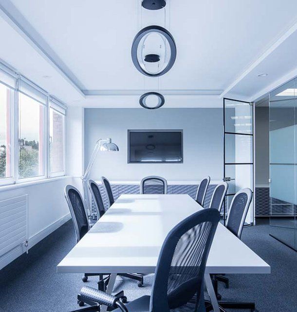
In the period since COVID forced many of us back home and out of the office, remote work has become the new norm for many. The flexibility of working from home, especially for those with small children, is very compelling, but making a productive workspace is more than setting up a desk in the spare room. More people are seeking to create functional and comfortable workspaces in their homes, however, it can be difficult to strike the right balance between a professional office space and a cosy home environment. Here are some tips for designing a home workspace that meets both of these needs: Dedicate a specific area for work Designating a specific area for work is essential for separating work from leisure time. This could be a separate room or just a corner of a room. It is important to make sure that the workspace is free from distractions and clutter, as this will help you stay focused and productive. Choose the right furniture Ergonomic furniture is key to a comfortable and productive workspace. Invest in a comfortable chair, a desk that is the right height, and a good-quality mouse and keyboard. If you are prone to back pain, consider a standing desk. Add personal touches Just because your workspace should be functional, doesn’t mean it can’t be personal. Add photos, plants, and other personal items to make the space feel like your own. This will help create a sense of comfort and make you feel at home in your workspace. Good lighting Good lighting is essential for a comfortable workspace. If possible, place your desk near a window for natural light. If not, invest in a high-quality desk lamp to provide bright, even light. Keep it organised An organised workspace will help you stay productive and focused. Use desk organisers, filing cabinets, and other tools to keep your work area free from clutter. A clean and organised workspace will also help you start each day with a clear mind. Consider your work style Think about the type of work you do and how you like to work. If you prefer a minimalist workspace, opt for a simple desk and a few basic supplies. If you need space for multiple screens and other technology, make sure you have enough room to work comfortably. Take breaks It’s important to take breaks throughout the day to avoid burnout. Step away from your desk, go for a walk, or do some stretching exercises to clear your mind and recharge.

Considerations to keep in mind when you are looking to upgrade your heating system